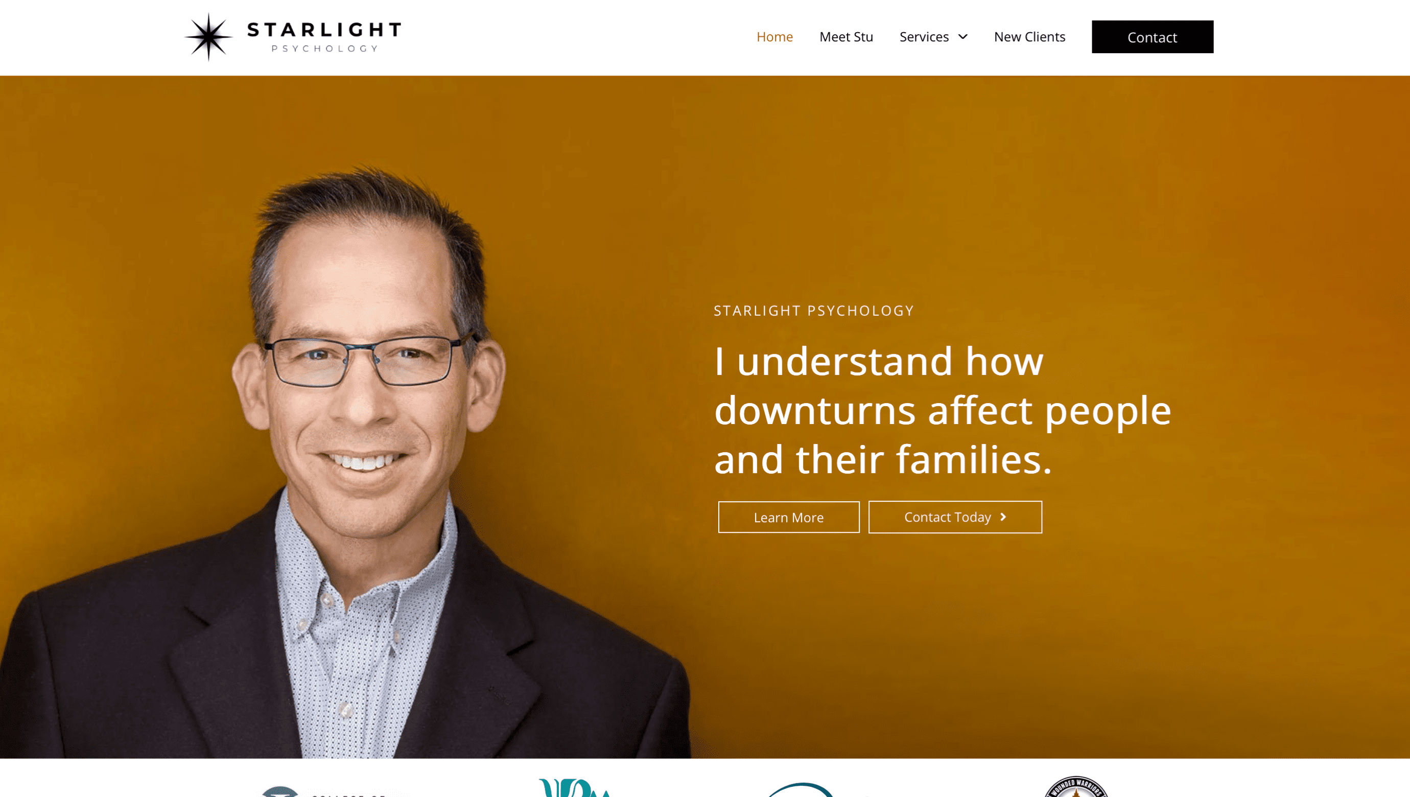
Starlight Psychology: A Guiding Light in Mental Health Care
Client: Dr. Stu Hoover, Psychologist
Services Provided: Branding, Website Development, Headshots, Explainer Video, SEO
Industry: Mental Health, Psychology
The Mission: When Dr. Stu Hoover first came to us, he was at a turning point. As one of Alberta’s top psychologists, his practice was well-established, but his branding? Not so much. Dr. Hoover’s original website and text logo had served their purpose during the early days of his practice, but they had become a hindrance rather than a help. The website was outdated, clunky, and not mobile-friendly, which was causing leads to slip through the cracks. Worse yet, potential clients were bouncing off his contact page—paralyzed by the fear that often comes with reaching out to a psychologist for the first time.
That’s where we came in. Dr. Hoover needed more than just a fresh look—he needed a complete reimagining of his online presence to better reflect his expertise and connect emotionally with his audience. We wanted his brand to do more than look good; it had to act as a guiding light for people seeking help during life’s battles.
The Challenges: Dr. Hoover’s old branding and website weren’t just outdated; they were costing him credibility in an increasingly competitive field. We needed to address several key issues:
- Outdated, Unengaging Website: His DIY website had served him well in the past, but it had become a digital roadblock. It wasn’t mobile-friendly, lacked SEO optimization, and provided an uninspiring customer experience.
- Loss of Leads Due to Fear: After deep research, we found that many potential clients were bouncing off the contact page. Why? Fear. The hesitation to reach out to a psychologist, particularly for the first time, was a barrier we needed to break down.
- Lack of Professional Branding: Dr. Hoover’s simple text logo wasn’t cutting it in a crowded marketplace. His brand needed a refresh—something that would reflect his authority and resonate with his clients.
Our Solution: To help Dr. Hoover stand out and connect more deeply with his clients, we approached the project from multiple angles. Here’s how we transformed his brand:
- Building a Brand Around “Starlight”: Dr. Hoover shared an interesting insight with us: In the Canadian Forces, the call-sign “Starlight” is used for medical personnel—essentially a call for help on the battlefield. This metaphor hit home. Life can feel like a battlefield, and sometimes, we need a guiding light to help us find our way. With this in mind, we developed a brand that would resonate with Dr. Hoover’s clients, positioning his practice as a beacon of hope and guidance in the face of life’s challenges.
- Revamping the Website: We didn’t just give Dr. Hoover a facelift—we built an entirely new digital experience. His new website was designed with speed, SEO, and mobile-friendliness in mind, ensuring potential clients could find him easily and navigate the site effortlessly, regardless of their device. Most importantly, we focused on lead generation, transforming the site into a conversion machine. By addressing key SEO elements and improving user experience, we were able to boost his lead conversion rate significantly.
- Breaking Down Barriers with an Explainer Video: After identifying that fear was stopping many potential clients from filling out the contact form, we collaborated with Dr. Hoover to create a warm, inviting explainer video. This video put a human face to his practice, helping to alleviate the intimidation factor. Once it was added to his new site, form submissions increased almost immediately, showing that sometimes, a personal touch makes all the difference.
- High-Resolution Headshots for a Professional Edge: To give Dr. Hoover’s brand a polished, authoritative feel, we partnered with Ryan Parker Photography to capture high-quality headshots. These weren’t just for his website—they would be used across multiple digital channels, enhancing his presence and making him more relatable to his audience.
The Results: We’re proud to say that our work with Dr. Hoover exceeded expectations in every way. Not only was the website delivered ahead of schedule and under budget, but it also resulted in a measurable increase in leads and conversions. Here are the key outcomes:
- Improved SEO & Lead Conversion: Thanks to the new site’s SEO optimization and enhanced user experience, Dr. Hoover’s practice is now positioned ahead of competitors, leading to an uptick in organic traffic and daily inquiries.
- Increased Form Submissions: The explainer video worked wonders in breaking down barriers, leading to a marked increase in contact form submissions shortly after launch.
- A Stronger, More Relatable Brand: The “Starlight” branding has resonated deeply with Dr. Hoover’s clients, providing a sense of hope and guidance that aligns perfectly with his mission.
But don’t just take our word for it—here’s what Dr. Hoover had to say: “Zach and the folks at Crow Creative were exceptional in educating me on what a web presence needs to be effective, and then implementing the plan we created. I’m very happy with the outcome of my site and felt my needs were anticipated and met by Zach. Very high attention to customer service and professionalism!” — Dr. Stu Hoover
At Crow Marketing, we don’t just design websites; we craft experiences that connect, engage, and convert. For Dr. Hoover, we transformed an outdated, disconnected brand into a guiding light for those seeking mental health support. We take pride in delivering results that can impact lives.
Explainer Video
New Logo


Headshot


