Horizon Mind Care: Building a Bold Brand That Stands Out
The Mission: Horizon Mind Care came to Crow Marketing with a clear goal in mind: they needed a bold, memorable brand that would immediately differentiate them from their competitors. In a crowded mental health space, simply having a unique offering wasn’t enough. They needed a brand that would spark curiosity, grab attention, and, most importantly, convert casual browsers into committed patients. It also needed to be versatile—working seamlessly across digital and traditional media, as well as on branded promotional items—all while remaining cost-effective.
The Challenge: Building a brand in the mental health sector involves striking the right balance between professionalism and approachability. The challenge was to design a logo and brand identity that would catch the eye without overwhelming, and communicate trustworthiness without feeling clinical or cold. It also needed to be something that patients would recognize instantly and associate with care, innovation, and reliability. Horizon Mind Care’s competitors were established, making it essential for the brand to break through the noise and create a lasting impression.
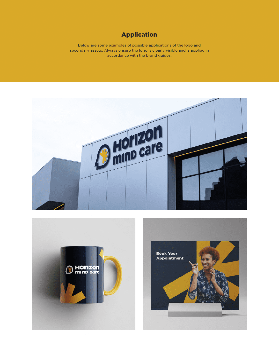
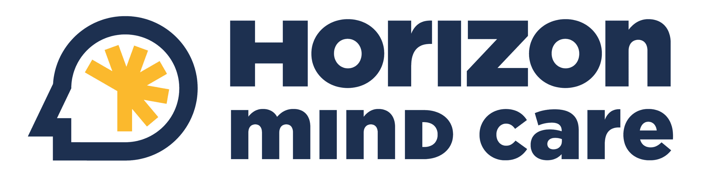
Our Solution: Our team took a geometric and bold approach to the logo design, ensuring it was simple, yet instantly recognizable. We avoided the complexities of cursive fonts or intricate details, opting instead for clean lines and strong, blocky brand elements that would translate well across different media. The color palette was carefully chosen to include bold contrasts—black, blue, and red—without being overwhelming. These design choices were intentional: bold logos with simple fonts and contrasting colors are easier to remember, and when you’re fighting for attention, being memorable is half the battle.
The brand we created was not only versatile but scalable. Whether used on the website, promotional items like mugs or pens, or across digital ads and printed materials, the logo and brand elements maintained their integrity. The consistent design ensured that no matter where the brand was seen, it left the same lasting impression.
The Results: The new brand for Horizon Mind Care accomplished exactly what it set out to do. The bold, geometric logo became a symbol of trust and care in the mental health community. The brand’s adaptability across various media ensured consistency and recognition, no matter where potential patients encountered it. In addition to meeting the client’s requirements, the project came in under budget and was delivered ahead of schedule, offering even more value to Horizon Mind Care.
Client Testimonial: “Zach and his crew are amazing! They have a freshness and creativity that is unmatched. I have referred them to many satisfied customers. I highly recommend checking them out if you need cutting-edge marketing at a reasonable price.”
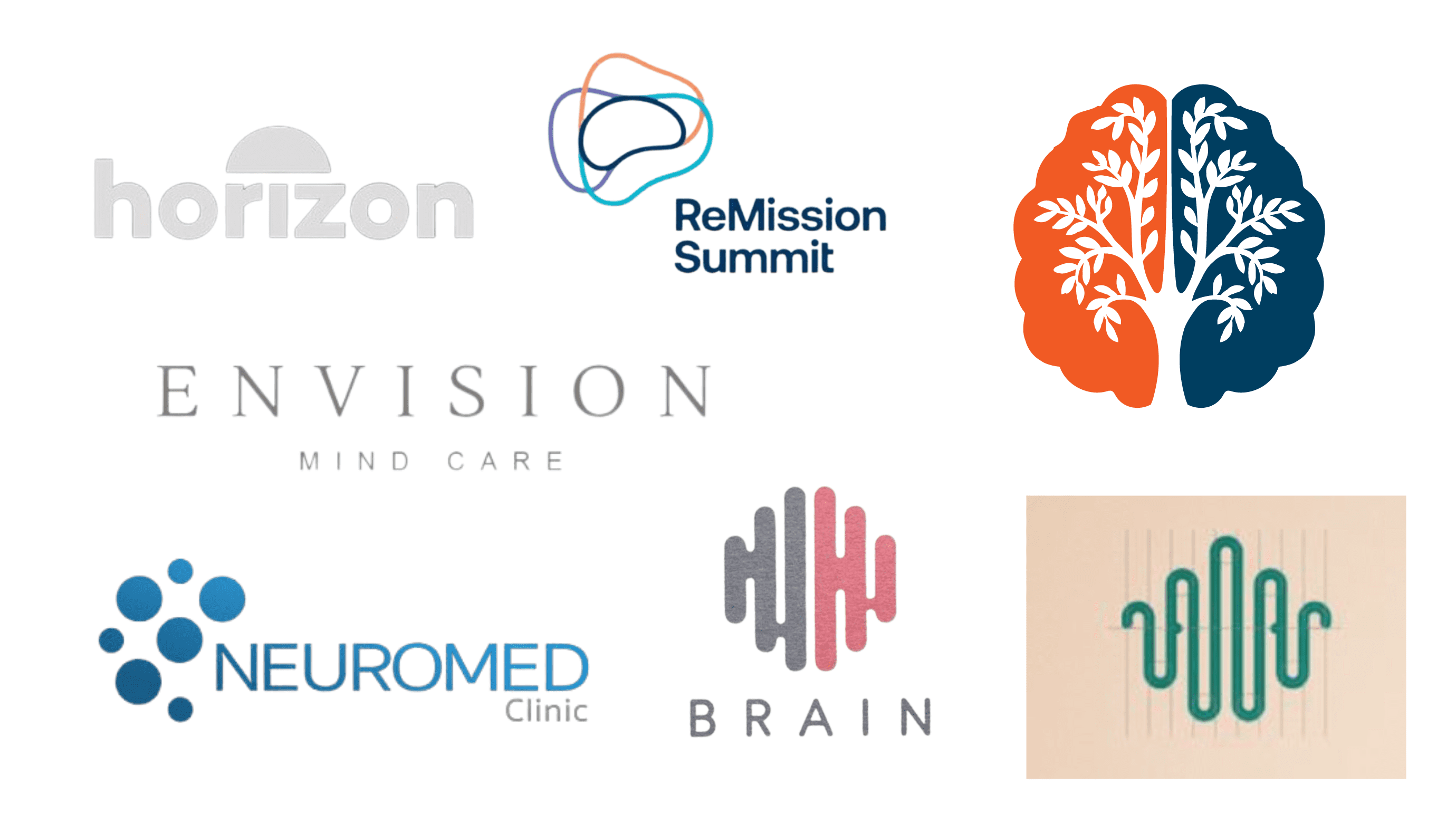
Client Inspiration
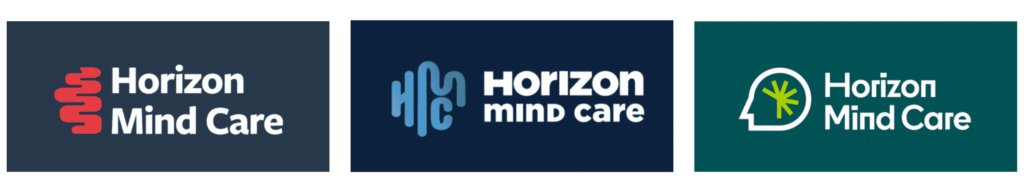
Initial Concepts
Final
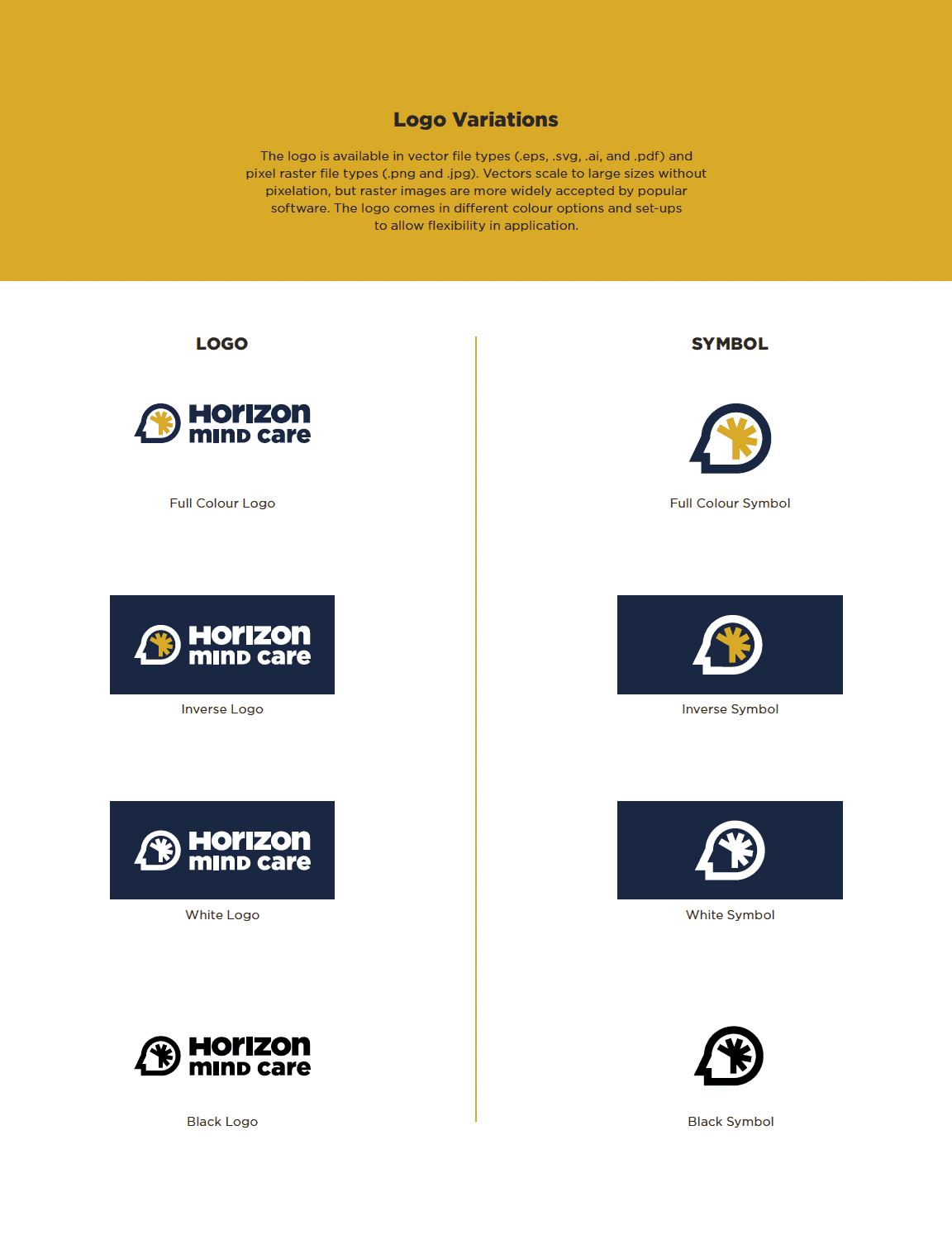
Variations
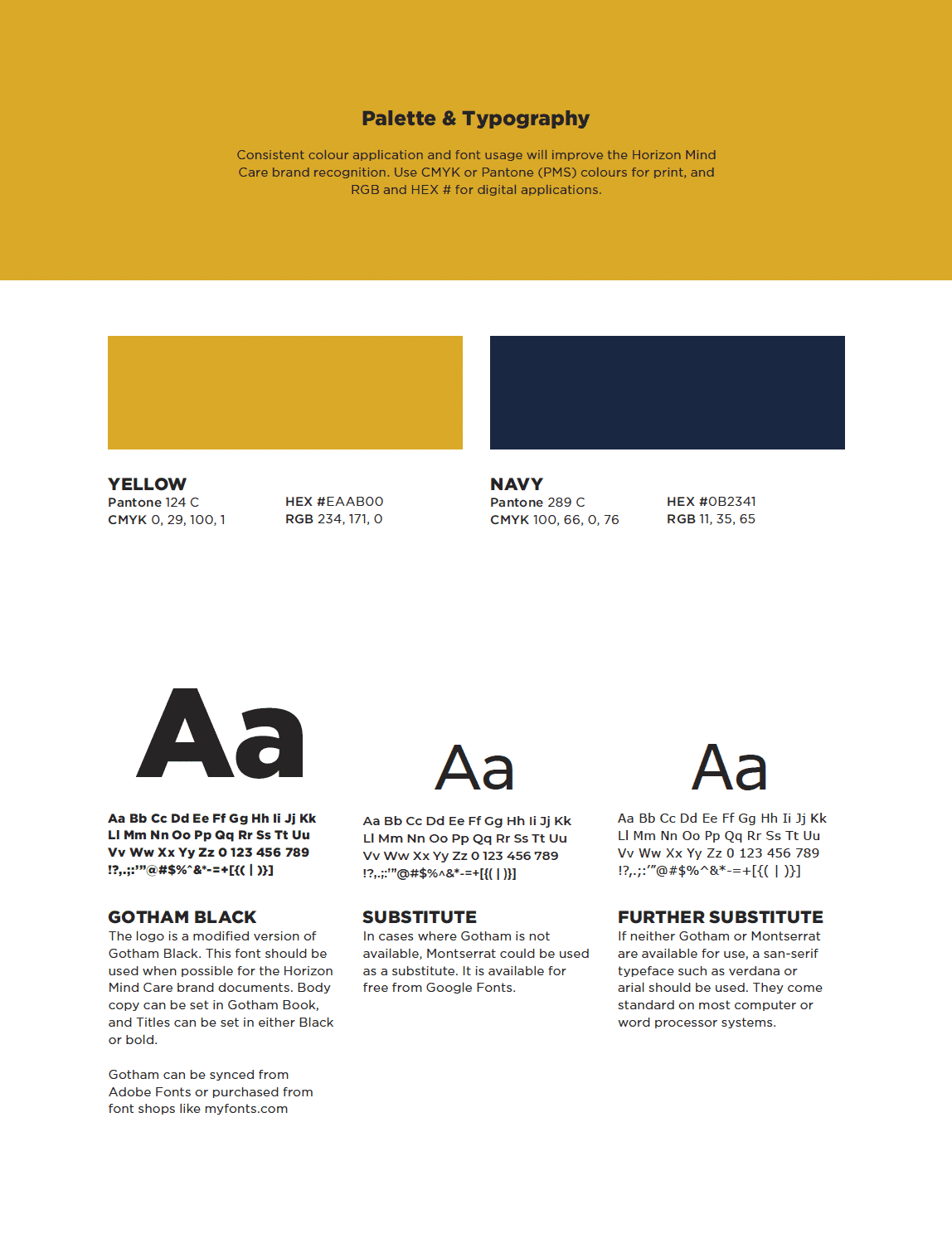
Palette & Typography
 Application