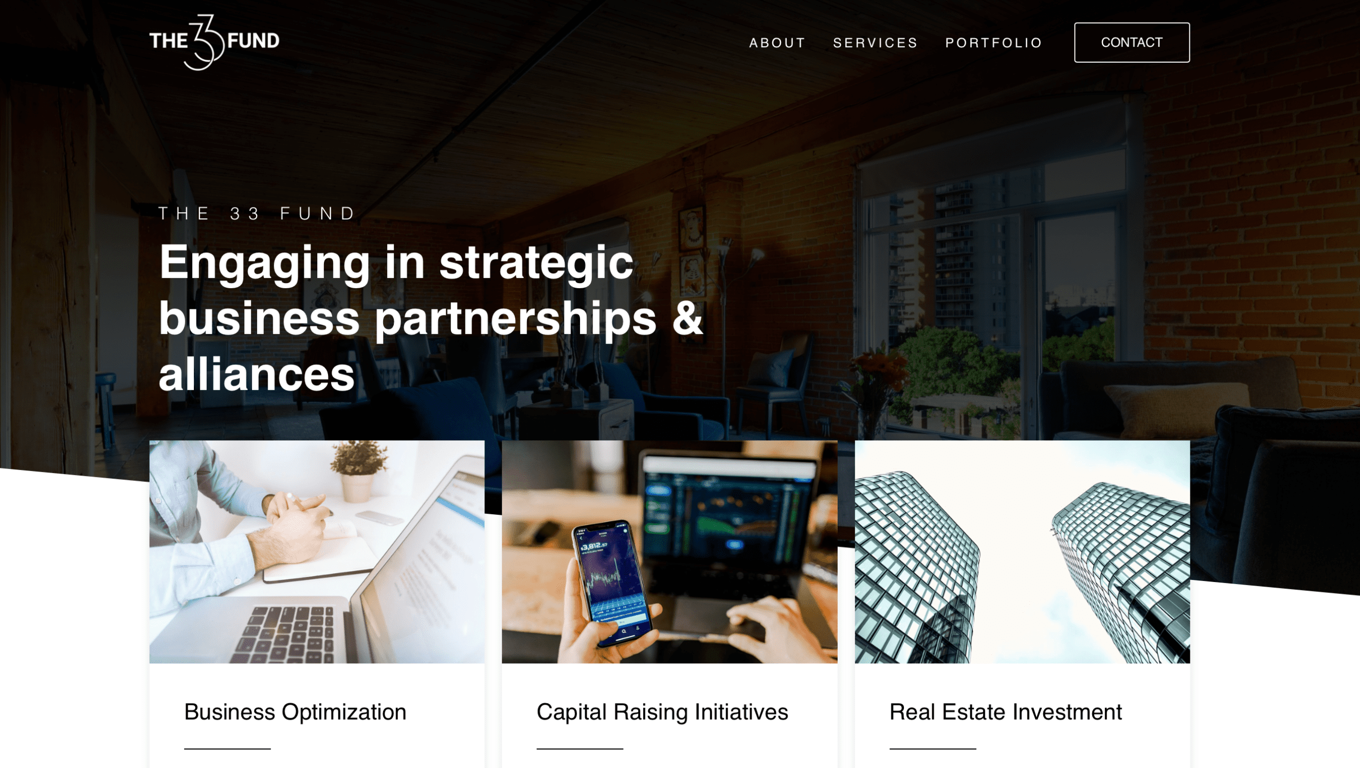
The 33 Fund: Building a Future-Ready Website That Drives Results
The Mission: The 33 Fund approached Crow Marketing with a clear objective: create a website that didn’t just look good but was built to perform. They needed a platform that informed the public, investors, and potential partners about their new organization in a way that was modern, user-friendly, and adaptable. The website had to be search engine-friendly, easy for their team to update, and fully responsive on all devices. Additionally, the client wanted a solid foundation that could grow and evolve as their business expanded.
The Challenge: Building a website for an emerging organization like The 33 Fund required a delicate balance between creating immediate impact and ensuring long-term scalability. The challenge wasn’t just about delivering a website that looked professional—it had to provide a seamless user experience while being robust enough to grow alongside the business. Crow also needed to ensure that potential investors and partners could quickly find the information they needed while driving leads through the site’s contact form.
Our Solution: We took a strategic approach, working closely with The 33 Fund to understand their vision and goals. By leveraging cutting-edge web technology and best practices, we built a fast, user-centered website that seamlessly combined design with functionality. The layout was simple yet effective, allowing for an educational, media-rich experience that would give the organization instant credibility. At the same time, we optimized every corner of the site for search engines, ensuring that it would rank highly in search results and attract the right audience.
One of the key features we implemented was a streamlined contact form to drive leads. This form wasn’t just a basic submission tool—it was designed to capture the right information efficiently, reducing the friction between potential investors and The 33 Fund’s team. And as requested, we made sure the site was incredibly easy for the client to update, allowing them to make changes as needed without being bogged down by complexity.
The Results: The finished website exceeded all expectations. Not only was it delivered ahead of schedule and under budget, but it also provided the solid foundation The 33 Fund needed for future growth. The site is fast, informative, and educational while being fully optimized for search engines and mobile devices. With an exceptional user experience and a clear path for future updates—like the potential addition of a members-only area—the website is ready to pivot and expand in parallel with the business.
Client Testimonial: “Zach and his team were referred to us by a colleague who has used Crow on two previous occasions, with great success. So I knew we were in good hands. What impressed me the most though was the questions that Zach and Paul asked about our business. They were specific, insightful, and extremely relevant. Especially with the uniqueness of what we do. I was very impressed. It was then that I knew why the referral came so highly recommended. From that day forward, it has been a great relationship. Their work is exceptional.”
